Matplotlib recipes
Matplotlib is a powerful tool for visualizing data and plotting graphs. But that power and flexibility entail many hours of searching the vast documentation for a needed function or a keyword. On this page I have gathered the code, with all the neat tricks and the details, for producing publication-ready graphs specifically useful in the domain of natural sciences.
See References for more tutorials and general information about Matplotlib.
Libraries and constants
All examples were written in the Jupyter Notebook, but should work in the shell or any IDE too.
A notebook usually begins with a little magic from IPython, importing key libraries — e.g., Pyplot, pandas, NumPy, sqlite3, and declaring constants — font and color for a consistent look.
Python
%matplotlib inline
%config InlineBackend.figure_format = 'svg'

import matplotlib.pyplot as plt
import pandas as pd
import numpy as np
import sqlite3

cfont = {'fontname': 'Clear Sans'}
ccolor = '#c3c3c3'
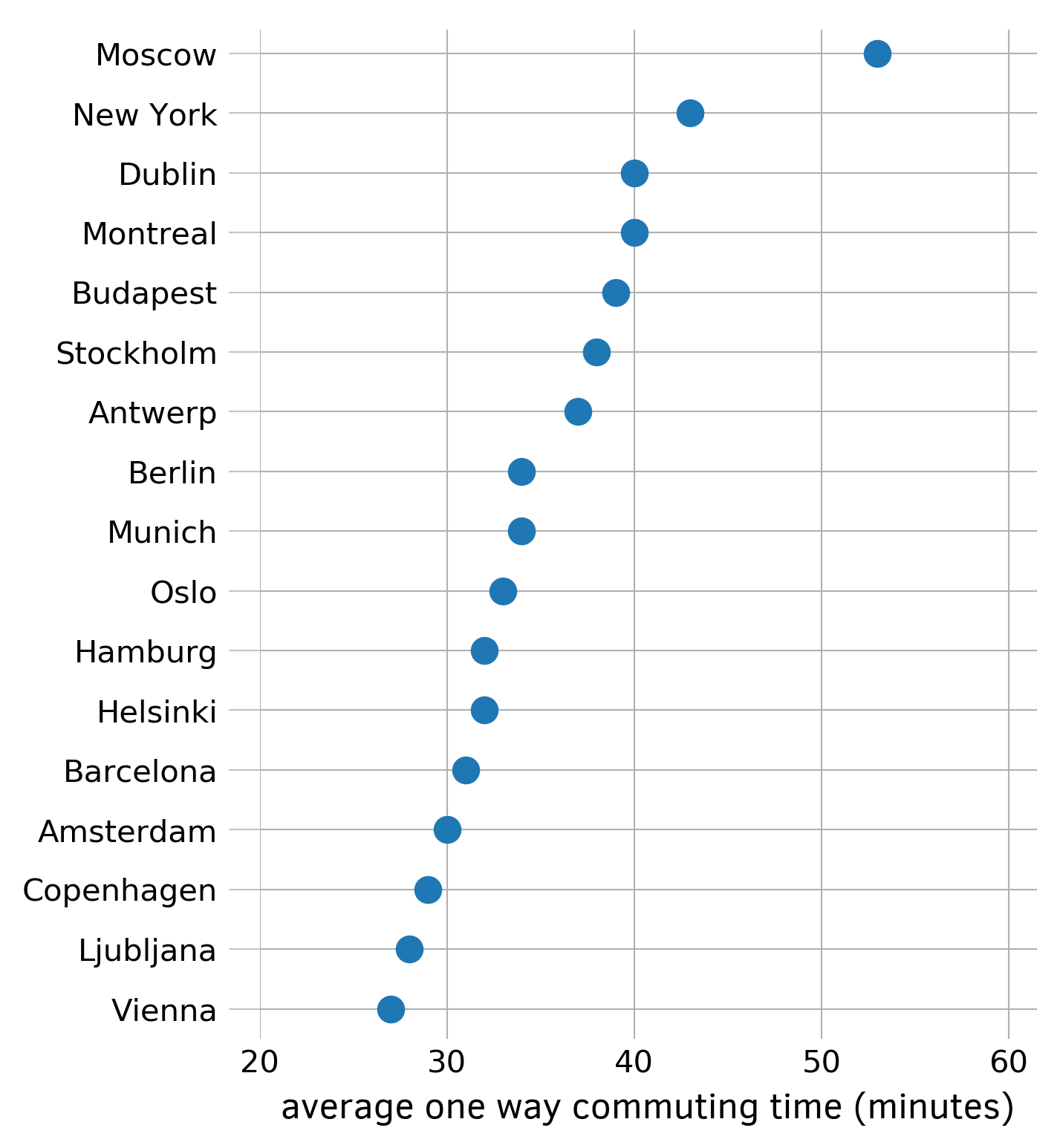
Dot plot
The dot plot is an alternative to the more ubiquitous bar chart, which uses less ink.
First, collect and sort data with a Series. In this example I use the average one-way commuting time from numbeo.com:
Python
commuting_time_array = Series({
    'Amsterdam': 22.1,
    'Barcelona': 30.0,
    'Bogota': 51.4,
    'Brisbane': 42.7,
    'Buenos Aires': 49.8,
    'Copenhagen': 26.9,
    'Dublin': 40.3,
    'Helsinki': 24.5,
    'London': 44.8,
    'Madrid': 27.9,
    'Melbourne': 42.0,
    'Montevideo': 41.4,
    'Oslo': 27.8,
    'Santiago': 37.1,
    'Sydney': 43.3,
    'Valencia': 19.7,
    'Vancouver': 36.0,
    })

commuting_time_array.sort_values(inplace=True, ascending=False)
Next, initialize the figure and the axes with the subplots function, set transparency off, and hide all four borders. Plot the values of commuting_time_array rounded by numpy.rint function with circles ('o') as markers. Draw ticks and tick labels. Adjust limits for both axes, label the x-axis, and draw the grid. Save the figure as a PNG file.
Python
fig, ax = plt.subplots(figsize=(4.5, 6))  # (width, height) in inches
fig.patch.set_alpha(1.0)                  # setting transparency off

ax.spines[:].set_visible(False)

number_of_cities = len(commuting_time_array)

markers = ax.plot(
    rint(commuting_time_array), range(number_of_cities), 'o', markersize=8
    )

ax.tick_params('y', length=10, width=0.5, color=ccolor)
ax.tick_params('x', length=0)

ax.set_yticks(markers[0].get_ydata())
ax.set_yticklabels(commuting_time_array.index, fontsize='medium', **cfont)

ax.set_xlim(19.3, 55)
ax.set_ylim(number_of_cities - 0.5, -0.4)

ax.set_xlabel(
    u'average one way commuting time (minutes)', fontsize='large', **cfont
    )

ax.grid(axis='both', linewidth=0.5)
fig.savefig('dot-plot.png', bbox_inches='tight', dpi=300, format='png')
Graph of function
In the natural sciences you can’t do without a basic graph of a function with arrowed axes. Here, we draw such a graph for the Morse potential.
Define the function and parameters (code by Robert Johansson):
Python
args = {'D': D, 'b': b}

x_min = -2*np.pi
x_max =  2*np.pi
N = 750


def U_morse(x, args):
    """
    Morse oscillator potential
    """

    D = args['D']
    b = args['b']

    u = D * (1-np.exp(-b*x)) ** 2

    return u
Find the minimum point:
Python
x = np.linspace(x_min, x_max, N)
U = U_morse(x, args)
x_opt_min = optimize.fmin(U_morse, [0.0], (args,))
Felix Hoffman wrote nice code for drawing axes with the Axes.arrow method:
Python
fig, ax = plt.subplots(figsize=(6, 4.5))   # (width, height) in inches
fig.patch.set_alpha(1.0)                   # setting transparency off

ax.spines[:].set_visible(False)

ax.set_xticks(x_opt_min)
ax.set_yticks([])
ax.set_xticklabels([r'$x_e$'], fontsize='x-large', **cfont)

ax.tick_params('both', length=0)

ax.set_xlabel(u'$x$',    fontsize='x-large', **cfont)
ax.set_ylabel(u'U($x$)', fontsize='x-large', **cfont)

ax.set_xlim(-2, 5)
ax.set_ylim( 0, 25)

# Drawing arrowed axes using code by Felix Hoffman

# get width and height of axes object to compute
# matching arrowhead length and width
dps = fig.dpi_scale_trans.inverted()
bbox = ax.get_window_extent().transformed(dps)
width, height = bbox.width, bbox.height

xmin, xmax = ax.get_xlim()
ymin, ymax = ax.get_ylim()

# manual arrowhead width and length
hw = 1./20. * (ymax-ymin)
hl = 1./20. * (xmax-xmin)

# compute matching arrowhead length and width
yhw = hw/(ymax-ymin)*(xmax-xmin) * height/width
yhl = hl/(xmax-xmin)*(ymax-ymin) * width/height

# draw x and y axes
ax.arrow(xmin, 0, xmax - xmin, 0,
         facecolor='black',
         edgecolor='black',
         linewidth=1.5,
         head_width=hw,
         head_length=hl,
         overhang=0.5,
         length_includes_head=True,
         clip_on=False,
        )

ax.arrow(-2, ymin, 0, ymax - ymin,
         facecolor='black',
         edgecolor='black',
         linewidth=1.5,
         head_width=yhw,
         head_length=yhl,
         overhang=0.5,
         length_includes_head=True,
         clip_on=False,
        )

ax.hlines(D, xmin, xmax, linestyles='dashed', linewidth=1.5, color='black')

ax.annotate(u'',
            xy=(x_max/2., D),
            xytext=(x_max/2., 0),
            arrowprops=dict(arrowstyle='<->', linewidth=1.5),
            )

ax.text(x_max/2. + 0.1, D/2.5, u'$D_e$', fontsize='x-large', **cfont)

ax.plot(x, U, linewidth=3)
fig.savefig('morse.png', bbox_inches='tight', dpi=300, format='png')
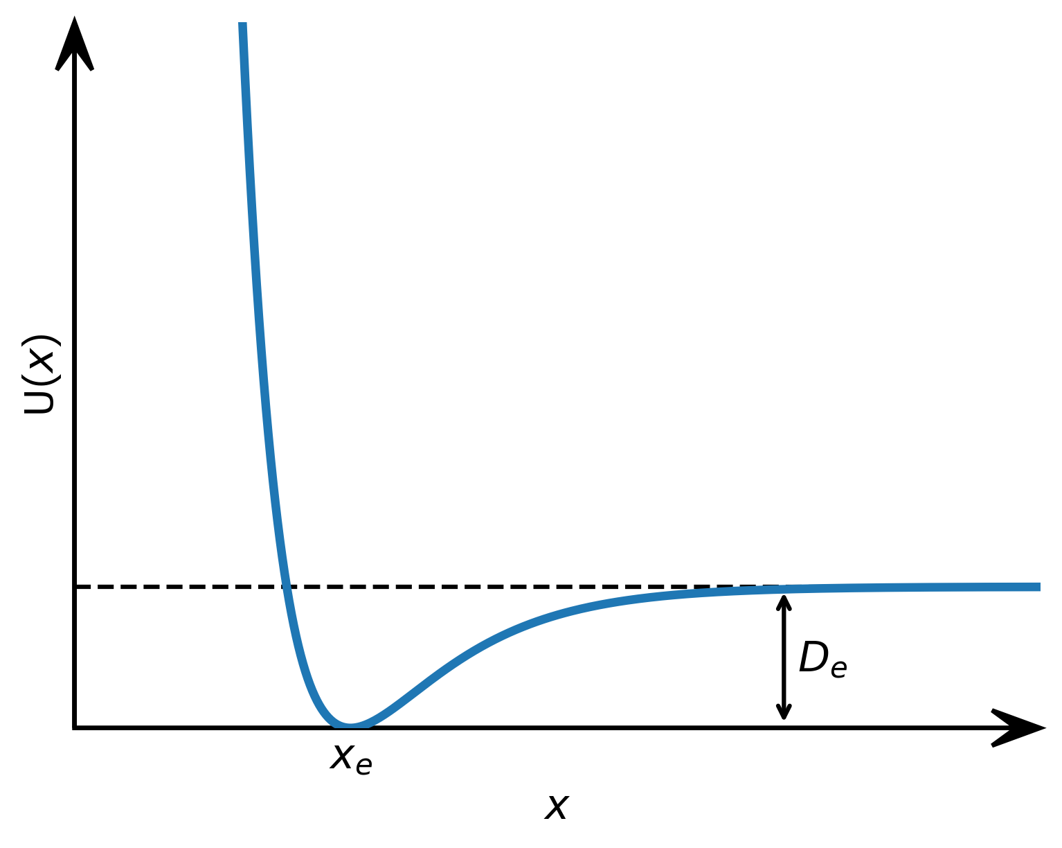
Figure 2: Graph of the Morse potential with arrowed axes and an annotation
Multi-panel figure
This code will read in data from an external file and draw two graphs side by side:
Python
args = {'D': D, 'b': b}

x_min = -2*np.pi
x_max =  2*np.pi
N = 750


def U_morse(x, args):
    """
    Morse oscillator potential
    """

    D = args['D']
    b = args['b']

    u = D * (1-np.exp(-b*x)) ** 2

    return u


x = np.linspace(x_min, x_max, N)
U = U_morse(x, args)
x_opt_min = optimize.fmin(U_morse, [0.0], (args,))

fig, ax = plt.subplots(figsize=(6, 4.5))   # (width, height) in inches
fig.patch.set_alpha(1.0)                   # setting transparency off

ax.spines[:].set_visible(False)

ax.set_xticks(x_opt_min)
ax.set_yticks([])
ax.set_xticklabels([r'$x_e$'], fontsize='x-large', **cfont)

ax.tick_params('both', length=0)

ax.set_xlabel(u'$x$',    fontsize='x-large', **cfont)
ax.set_ylabel(u'U($x$)', fontsize='x-large', **cfont)

ax.set_xlim(-2, 5)
ax.set_ylim( 0, 25)

# Drawing arrowed axes using code by Felix Hoffman

# get width and height of axes object to compute
# matching arrowhead length and width
dps = fig.dpi_scale_trans.inverted()
bbox = ax.get_window_extent().transformed(dps)
width, height = bbox.width, bbox.height

xmin, xmax = ax.get_xlim()
ymin, ymax = ax.get_ylim()

# manual arrowhead width and length
hw = 1./20. * (ymax-ymin)
hl = 1./20. * (xmax-xmin)

# compute matching arrowhead length and width
yhw = hw/(ymax-ymin)*(xmax-xmin) * height/width
yhl = hl/(xmax-xmin)*(ymax-ymin) * width/height

# draw x and y axes
ax.arrow(xmin, 0, xmax - xmin, 0,
         facecolor='black',
         edgecolor='black',
         linewidth=1.5,
         head_width=hw,
         head_length=hl,
         overhang=0.5,
         length_includes_head=True,
         clip_on=False,
        )

ax.arrow(-2, ymin, 0, ymax - ymin,
         facecolor='black',
         edgecolor='black',
         linewidth=1.5,
         head_width=yhw,
         head_length=yhl,
         overhang=0.5,
         length_includes_head=True,
         clip_on=False,
        )

ax.hlines(D, xmin, xmax, linestyles='dashed', linewidth=1.5, color='black')

ax.annotate(u'',
            xy=(x_max/2., D),
            xytext=(x_max/2., 0),
            arrowprops=dict(arrowstyle='<->', linewidth=1.5),
            )

ax.text(x_max/2. + 0.1, D/2.5, u'$D_e$', fontsize='x-large', **cfont)

ax.plot(x, U, linewidth=3)
fig.savefig('morse.png', bbox_inches='tight', dpi=300, format='png')
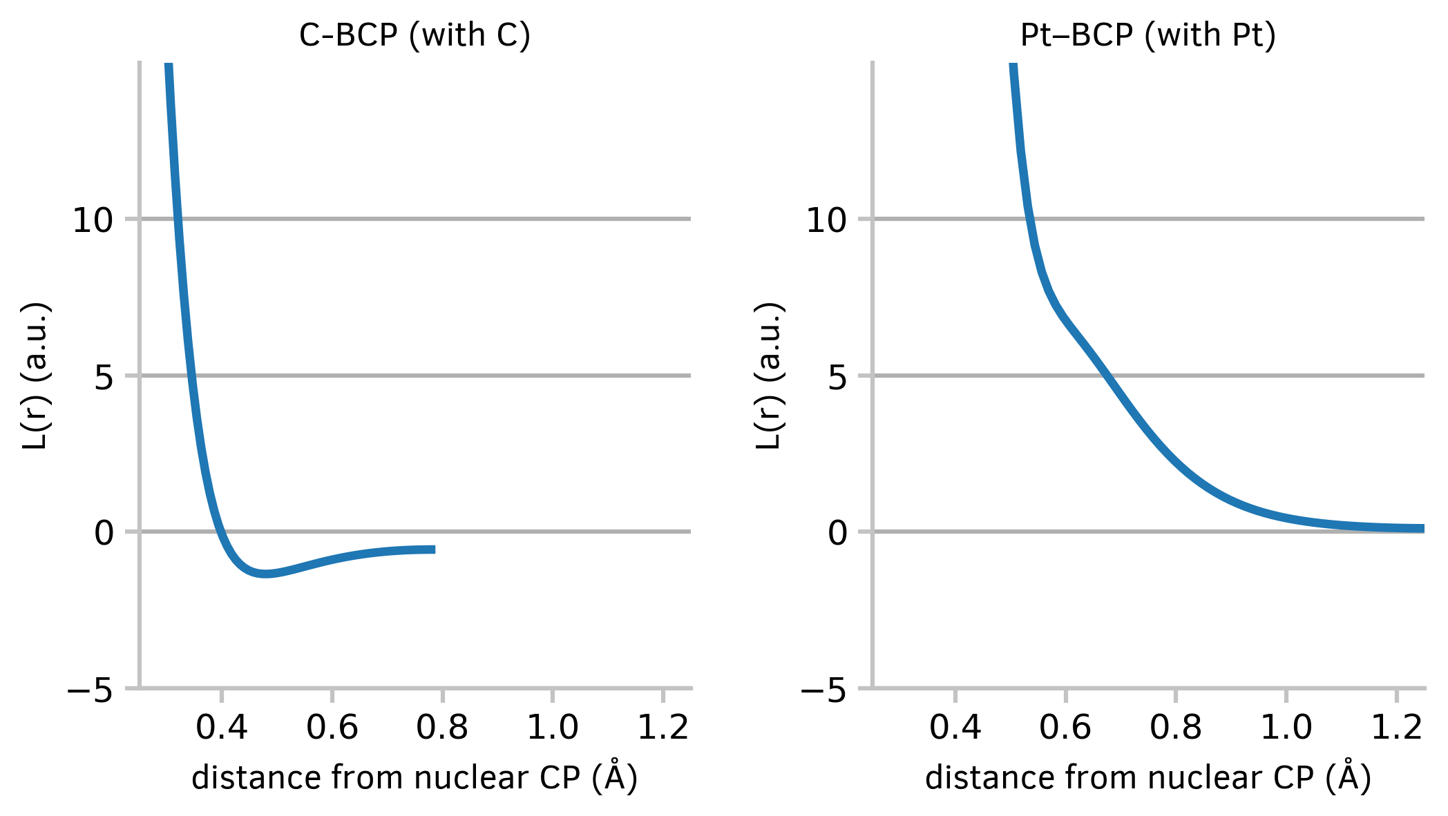
Figure 3: Two graphs of a continuous variable plotted side by side
Density plots
The plots of kernel density estimation of the probability density function may be useful in exploring big datasets.
First, in order to retrieve data, connect to the sqlite3 databases and execute a simple SQL query. Next, construct a DataFrame which will contain both datasets. Draw graphs with the convenient Pandas plot method.
Python
query = 'select * from search1_DIST1;'
index_col = 'MOL_ID'

with sqlite3.connect('/home/markov/tmp/pd3.8.sqlite') as conn_pd, \
     sqlite3.connect('/home/markov/tmp/pt3.8.sqlite') as conn_pt:
         dist_pd = pd.read_sql_query(query, conn_pd, index_col=index_col)
         dist_pt = pd.read_sql_query(query, conn_pt, index_col=index_col)

dist_pd = dist_pd.rename(columns={'DIST1': 'Pd-Pd distance'})
dist_pt = dist_pt.rename(columns={'DIST1': 'Pt-Pt distance'})

ax = dist_pt['Pt-Pt distance'].plot(kind='kde', figsize=(6, 4.5),
                                    xlim=(2.3, 3.8), ylim=(0, 2),
                                    linewidth=3,
                                   )

dist_pd['Pd-Pd distance'].plot(kind='kde', ax=ax, linewidth=3)

ax.figure.patch.set_alpha(1.0)  # setting transparency off
ax.grid(axis='both', linewidth=grid_lw)

L = ax.legend()
plt.setp(L.texts,
         size='large',
         **cfont)  # ax.legend() can set fontsize, but not fontname

ax.spines[:].set_linewidth(grid_lw)
ax.spines[:].set_color(ccolor)

ax.tick_params(labelsize='large', length=5, width=grid_lw, color=ccolor)

ax.set_xlabel(u'R(M-M) (Å)', fontsize='x-large', **cfont)
ax.set_ylabel(u'Density', fontsize='x-large', **cfont)

ax.set_xticks([2.3, 2.6, 2.9, 3.2, 3.5, 3.8])
ax.set_yticks([0.5, 1.0, 1.5, 2.0])

ax.annotate(text=u'2.49 Å',
            xy=(2.492, 0.29),
            xytext=(2.31, 0.55),
            arrowprops=dict(arrowstyle='simple',
                            facecolor='tab:blue',
                            edgecolor='tab:blue'),
            color='tab:blue',
            fontsize='large',
            **cfont)

ax.annotate(u'2.70 Å', xy=(2.63, 1.9),
            fontsize='large', color='tab:blue', **cfont)

ax.annotate(u'2.78 Å', xy=(2.75, 1.76),
            fontsize='large', color='tab:orange', **cfont)

ax.figure.savefig('density-plots.png',
                  bbox_inches='tight',
                  dpi=300, format='png')
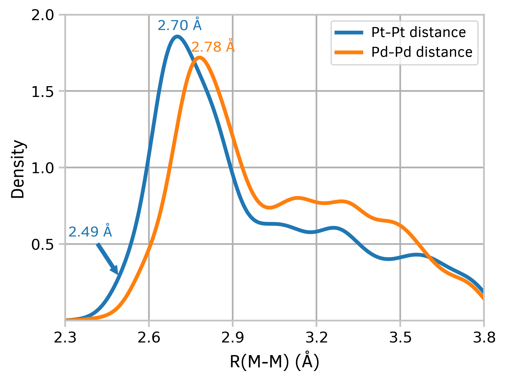
Figure 4: Kernel density estimation plots
2D hexagonal binning plots
A 2D hexagonal binning plot is a graphical representation of data in which a hexagonal grid is used to bin the data points. Each hexagonal bin is represented by a single point, and the value of the bin is represented by the color or size of the point. This type of plot is useful for visualizing large datasets and for identifying patterns and trends in the data. For example, fingerprint plots are the visual representation of all the intermolecular distances simultaneously, and are unique for a given crystal structure and polymorph. Here, we draw fingerprint plots for four different crystal forms of platinum acetate.
First, read in data from an external file:
Python
def read_data(logfile, s):
    with open(logfile, 'r') as f:
        sw = False
        a = []
        for line in f:
            if (r'begin ' + s) in line:
                sw = True
                continue
            if sw:
                if (r'end ' + s) in line:
                    sw = False
                    break
                a.append(line)
    return np.array(a, dtype=np.float64)


d_i_1 = read_data('/home/markov/tmp/cher.cxs', 'd_i')
d_e_1 = read_data('/home/markov/tmp/cher.cxs', 'd_e')

d_i_2 = read_data('/home/markov/tmp/Pt43_253.cxs', 'd_i')
d_e_2 = read_data('/home/markov/tmp/Pt43_253.cxs', 'd_e')

d_i_3 = read_data('/home/markov/tmp/1874439_platac2.cxs', 'd_i')
d_e_3 = read_data('/home/markov/tmp/1874439_platac2.cxs', 'd_e')

d_i_4 = read_data('/home/markov/tmp/1987363_pt32.cxs', 'd_i')
d_e_4 = read_data('/home/markov/tmp/1987363_pt32.cxs', 'd_e')
To draw a 2D hexagonal binning plot, you will need to use the hexbin method:
Python
fig, ((ax1, ax2), (ax3, ax4)) = plt.subplots(2, 2, figsize=(8, 8),
                                             gridspec_kw=({'hspace': 0.6,
                                                           'wspace': 0.6}))

fig.patch.set_alpha(1.0)                  # setting transparency off

cmap = 'plasma'
fw = 'bold'

cm = ax1.hexbin(d_i_1, d_e_1, mincnt=1, cmap=cmap)
ax1.set_title(u'1', fontweight=fw, **cfont)

ax2.hexbin(d_i_2, d_e_2, mincnt=1, cmap=cmap)
ax2.set_title(u'2', fontweight=fw, **cfont)

ax3.hexbin(d_i_3, d_e_3, mincnt=1, cmap=cmap)
ax3.set_title(u'3', fontweight=fw, **cfont)

ax4.hexbin(d_i_4, d_e_4, mincnt=1, cmap=cmap)
ax4.set_title(u'4', fontweight=fw, **cfont)

cax = plt.axes([0.10, 0.48, 0.80, 0.02])
cb = fig.colorbar(cm, cax=cax, orientation='horizontal')
cax.tick_params(labelsize='medium')

for item in [ax1, ax2, ax3, ax4]:
    for spine in ['top', 'right']:
        item.spines[spine].set_visible(False)

    for spine in ['bottom', 'left']:
        item.spines[spine].set_linewidth(1.5)
        item.spines[spine].set_color(ccolor)

    item.set_xticks([1.0, 1.5, 2.0, 2.5])
    item.tick_params(labelsize='large', length=5, width=1.5, color=ccolor)
    item.set_xlim(0.5, 2.8)
    item.set_ylim(0.5, 2.8)
    item.set_xlabel(u'$d_i$ (Å)', **cfont)
    item.set_ylabel(u'$d_e$ (Å)', **cfont)

fig.savefig('2d-binning-plots.png',
            bbox_inches='tight',
            dpi=300, format='png')
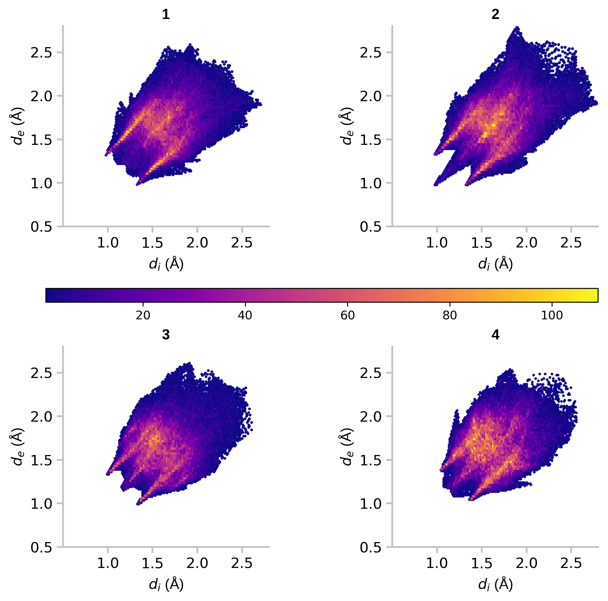
Figure 5: 2D hexagonal binning plots
References
- Matplotlib
- Jupyter Notebook
- Matplotlib: Anatomy of a figure
- Fundamentals of Data Visualization by Claus O. Wilke
- Chartjunk by Edward Tufte from "The Visual Display of Quantitative Information"